【Top 3】Stylish Headers with Copy & Paste HTML and CSS
Thank you for your continued support.
This article contains advertisements that help fund our operations.
Table Of Contents
Headers are an important element that sets the first impression of a website. This time, we introduce 3 types of modern and stylish header designs. All are responsive and switch to a hamburger menu on smartphones.

Common Features
All headers include the following features:
- Responsive Design: Automatically switches to a hamburger menu below 768px
- Smooth Animations: Smooth transitions using CSS transition
- Accessibility Support: Proper contrast and hover effects
- Lightweight Implementation: High performance with minimal JavaScript
1. Modern Minimal Header
A header featuring a simple and clean design. It suits any website and gives a professional impression.
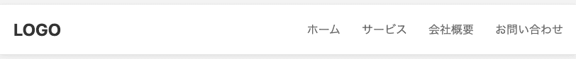
Features
- White background with drop shadow creating a floating effect
- Navigation links with underline animation on hover
- Minimal and sophisticated design
HTML
<header class="header-modern">
  <div class="container">
    <a href="#" class="logo">LOGO</a>
    <div class="nav-wrapper">
      <nav>
        <ul class="nav-links">
          <li><a href="#">ホーム</a></li>
          <li><a href="#">サービス</a></li>
          <li><a href="#">会社概要</a></li>
          <li><a href="#">お問い合わせ</a></li>
        </ul>
      </nav>
      <div class="hamburger" onclick="toggleMenu()">
        <span></span>
        <span></span>
        <span></span>
      </div>
    </div>
  </div>
  <div class="mobile-menu">
    <ul>
      <li><a href="#">ホーム</a></li>
      <li><a href="#">サービス</a></li>
      <li><a href="#">会社概要</a></li>
      <li><a href="#">お問い合わせ</a></li>
    </ul>
  </div>
</header>
CSS
.header-modern {
  background: #ffffff;
  box-shadow: 0 2px 10px rgba(0, 0, 0, 0.1);
  position: relative;
  z-index: 1000;
}

.header-modern .container {
  max-width: 1200px;
  margin: 0 auto;
  padding: 0 20px;
  display: flex;
  justify-content: space-between;
  align-items: center;
  height: 70px;
}

.header-modern .logo {
  font-size: 24px;
  font-weight: 700;
  color: #333;
  text-decoration: none;
  transition: color 0.3s ease;
}

.header-modern .logo:hover {
  color: #007bff;
}

.header-modern .nav-wrapper {
  display: flex;
  align-items: center;
  gap: 40px;
}

.header-modern .nav-links {
  display: flex;
  list-style: none;
  gap: 30px;
}

.header-modern .nav-links a {
  color: #666;
  text-decoration: none;
  font-weight: 500;
  transition: color 0.3s ease;
  position: relative;
}

.header-modern .nav-links a::after {
  content: "";
  position: absolute;
  bottom: -5px;
  left: 0;
  width: 0;
  height: 2px;
  background: #007bff;
  transition: width 0.3s ease;
}

.header-modern .nav-links a:hover::after {
  width: 100%;
}

.header-modern .hamburger {
  display: none;
  flex-direction: column;
  cursor: pointer;
  gap: 4px;
  padding: 5px;
}

.header-modern .hamburger span {
  width: 25px;
  height: 3px;
  background: #333;
  transition: all 0.3s ease;
  border-radius: 3px;
}

.header-modern .hamburger.active span:nth-child(1) {
  transform: rotate(45deg) translate(5px, 5px);
}

.header-modern .hamburger.active span:nth-child(2) {
  opacity: 0;
}

.header-modern .hamburger.active span:nth-child(3) {
  transform: rotate(-45deg) translate(7px, -6px);
}

.header-modern .mobile-menu {
  position: absolute;
  top: 70px;
  left: 0;
  right: 0;
  background: white;
  box-shadow: 0 5px 20px rgba(0, 0, 0, 0.1);
  max-height: 0;
  overflow: hidden;
  transition: max-height 0.3s ease;
}

.header-modern .mobile-menu.active {
  max-height: 400px;
}

.header-modern .mobile-menu ul {
  list-style: none;
  padding: 20px;
}

.header-modern .mobile-menu li {
  padding: 10px 0;
  border-bottom: 1px solid #eee;
}

.header-modern .mobile-menu a {
  color: #333;
  text-decoration: none;
  font-weight: 500;
  display: block;
  transition: color 0.3s ease;
}

.header-modern .mobile-menu a:hover {
  color: #007bff;
}

@media (max-width: 768px) {
  .header-modern .nav-links {
    display: none;
  }

  .header-modern .hamburger {
    display: flex;
  }
}
2. Gradient Header
A modern and stylish header featuring a beautiful gradient design.

Features
- Beautiful purple-toned gradient background
- Navigation effect that highlights the background on hover
- High visibility ensured with white text
HTML
<header class="header-gradient">
  <div class="container">
    <a href="#" class="logo">LOGO</a>
    <div class="nav-wrapper">
      <nav>
        <ul class="nav-links">
          <li><a href="#">ホーム</a></li>
          <li><a href="#">サービス</a></li>
          <li><a href="#">会社概要</a></li>
          <li><a href="#">お問い合わせ</a></li>
        </ul>
      </nav>
      <div class="hamburger" onclick="toggleMenu()">
        <span></span>
        <span></span>
        <span></span>
      </div>
    </div>
  </div>
  <div class="mobile-menu">
    <ul>
      <li><a href="#">ホーム</a></li>
      <li><a href="#">サービス</a></li>
      <li><a href="#">会社概要</a></li>
      <li><a href="#">お問い合わせ</a></li>
    </ul>
  </div>
</header>
CSS
.header-gradient {
  background: linear-gradient(135deg, #667eea 0%, #764ba2 100%);
  position: relative;
  z-index: 1000;
}

.header-gradient .container {
  max-width: 1200px;
  margin: 0 auto;
  padding: 0 20px;
  display: flex;
  justify-content: space-between;
  align-items: center;
  height: 80px;
}

.header-gradient .logo {
  font-size: 28px;
  font-weight: 700;
  color: white;
  text-decoration: none;
  text-shadow: 2px 2px 4px rgba(0, 0, 0, 0.1);
  transition: transform 0.3s ease;
}

.header-gradient .logo:hover {
  transform: scale(1.05);
}

.header-gradient .nav-wrapper {
  display: flex;
  align-items: center;
  gap: 40px;
}

.header-gradient .nav-links {
  display: flex;
  list-style: none;
  gap: 35px;
}

.header-gradient .nav-links a {
  color: rgba(255, 255, 255, 0.9);
  text-decoration: none;
  font-weight: 500;
  transition: all 0.3s ease;
  position: relative;
  padding: 5px 10px;
  border-radius: 20px;
}

.header-gradient .nav-links a:hover {
  background: rgba(255, 255, 255, 0.2);
  color: white;
}

.header-gradient .hamburger {
  display: none;
  flex-direction: column;
  cursor: pointer;
  gap: 5px;
  padding: 5px;
}

.header-gradient .hamburger span {
  width: 28px;
  height: 3px;
  background: white;
  transition: all 0.3s ease;
  border-radius: 3px;
}

.header-gradient .hamburger.active span:nth-child(1) {
  transform: rotate(45deg) translate(6px, 6px);
}

.header-gradient .hamburger.active span:nth-child(2) {
  opacity: 0;
}

.header-gradient .hamburger.active span:nth-child(3) {
  transform: rotate(-45deg) translate(7px, -6px);
}

.header-gradient .mobile-menu {
  position: absolute;
  top: 80px;
  left: 0;
  right: 0;
  background: linear-gradient(135deg, #667eea 0%, #764ba2 100%);
  max-height: 0;
  overflow: hidden;
  transition: max-height 0.3s ease;
}

.header-gradient .mobile-menu.active {
  max-height: 400px;
  box-shadow: 0 5px 20px rgba(0, 0, 0, 0.2);
}

.header-gradient .mobile-menu ul {
  list-style: none;
  padding: 20px;
}

.header-gradient .mobile-menu li {
  padding: 12px 0;
  border-bottom: 1px solid rgba(255, 255, 255, 0.2);
}

.header-gradient .mobile-menu a {
  color: white;
  text-decoration: none;
  font-weight: 500;
  display: block;
  transition: all 0.3s ease;
}

.header-gradient .mobile-menu a:hover {
  padding-left: 10px;
  color: #ffeb3b;
}

@media (max-width: 768px) {
  .header-gradient .nav-links {
    display: none;
  }

  .header-gradient .hamburger {
    display: flex;
  }
}
3. Glassmorphism Header
A transparent header that incorporates glassmorphism, one of the latest UI trends.

Features
- Semi-transparent background with blur effect using
backdrop-filter - Modern and sophisticated appearance
- Border animation on hover
HTML
<header class="header-glass">
  <div class="container">
    <a href="#" class="logo">LOGO</a>
    <div class="nav-wrapper">
      <nav>
        <ul class="nav-links">
          <li><a href="#">ホーム</a></li>
          <li><a href="#">サービス</a></li>
          <li><a href="#">会社概要</a></li>
          <li><a href="#">お問い合わせ</a></li>
        </ul>
      </nav>
      <div class="hamburger" onclick="toggleMenu()">
        <span></span>
        <span></span>
        <span></span>
      </div>
    </div>
  </div>
  <div class="mobile-menu">
    <ul>
      <li><a href="#">ホーム</a></li>
      <li><a href="#">サービス</a></li>
      <li><a href="#">会社概要</a></li>
      <li><a href="#">お問い合わせ</a></li>
    </ul>
  </div>
</header>
CSS
.header-glass {
  background: rgba(255, 255, 255, 0.7);
  backdrop-filter: blur(10px);
  -webkit-backdrop-filter: blur(10px);
  box-shadow: 0 8px 32px 0 rgba(31, 38, 135, 0.15);
  border-bottom: 1px solid rgba(255, 255, 255, 0.18);
  position: relative;
  z-index: 1000;
}

.header-glass .container {
  max-width: 1200px;
  margin: 0 auto;
  padding: 0 20px;
  display: flex;
  justify-content: space-between;
  align-items: center;
  height: 75px;
}

.header-glass .logo {
  font-size: 26px;
  font-weight: 700;
  color: #1976d2;
  text-decoration: none;
  transition: all 0.3s ease;
  display: flex;
  align-items: center;
  gap: 10px;
}

.header-glass .logo::before {
  content: "◆";
  font-size: 20px;
  color: #42a5f5;
}

.header-glass .logo:hover {
  transform: translateY(-2px);
  filter: drop-shadow(0 5px 10px rgba(25, 118, 210, 0.3));
}

.header-glass .nav-wrapper {
  display: flex;
  align-items: center;
  gap: 40px;
}

.header-glass .nav-links {
  display: flex;
  list-style: none;
  gap: 35px;
}

.header-glass .nav-links a {
  color: #424242;
  text-decoration: none;
  font-weight: 600;
  transition: all 0.3s ease;
  position: relative;
  padding: 8px 16px;
  border-radius: 30px;
  border: 2px solid transparent;
}

.header-glass .nav-links a:hover {
  color: #1976d2;
  background: rgba(33, 150, 243, 0.1);
  border-color: rgba(33, 150, 243, 0.3);
}

.header-glass .hamburger {
  display: none;
  flex-direction: column;
  cursor: pointer;
  gap: 5px;
  padding: 8px;
  border-radius: 8px;
  background: rgba(255, 255, 255, 0.5);
  transition: background 0.3s ease;
}

.header-glass .hamburger:hover {
  background: rgba(255, 255, 255, 0.8);
}

.header-glass .hamburger span {
  width: 25px;
  height: 3px;
  background: #1976d2;
  transition: all 0.3s ease;
  border-radius: 3px;
}

.header-glass .hamburger.active span:nth-child(1) {
  transform: rotate(45deg) translate(5px, 5px);
}

.header-glass .hamburger.active span:nth-child(2) {
  opacity: 0;
}

.header-glass .hamburger.active span:nth-child(3) {
  transform: rotate(-45deg) translate(7px, -6px);
}

.header-glass .mobile-menu {
  position: absolute;
  top: 75px;
  left: 0;
  right: 0;
  background: rgba(255, 255, 255, 0.9);
  backdrop-filter: blur(10px);
  -webkit-backdrop-filter: blur(10px);
  max-height: 0;
  overflow: hidden;
  transition: max-height 0.3s ease;
  border-radius: 0 0 20px 20px;
}

.header-glass .mobile-menu.active {
  max-height: 400px;
  box-shadow: 0 10px 30px rgba(0, 0, 0, 0.1);
}

.header-glass .mobile-menu ul {
  list-style: none;
  padding: 20px;
}

.header-glass .mobile-menu li {
  padding: 12px 0;
  border-bottom: 1px solid rgba(0, 0, 0, 0.05);
}

.header-glass .mobile-menu a {
  color: #424242;
  text-decoration: none;
  font-weight: 600;
  display: block;
  transition: all 0.3s ease;
  padding: 5px 0;
}

.header-glass .mobile-menu a:hover {
  color: #1976d2;
  padding-left: 10px;
}

@media (max-width: 768px) {
  .header-glass .nav-links {
    display: none;
  }

  .header-glass .hamburger {
    display: flex;
  }
}
JavaScript (Common)
This is the hamburger menu toggle functionality used across all headers.
function toggleMenu() {
  const hamburger = document.querySelector(".hamburger")
  const mobileMenu = document.querySelector(".mobile-menu")

  hamburger.classList.toggle("active")
  mobileMenu.classList.toggle("active")
}
Implementation Highlights
1. Responsive Design
- Uses media queries (
@media (max-width: 768px)) - Shows standard navigation on PC, hamburger menu on mobile
2. Animation
- Smooth transitions with the
transitionproperty - Optimized performance using
transformandopacity
3. Accessibility
- Ensures appropriate contrast ratio
- Hover effects make interactive elements clear
4. Performance
- Most behavior handled with CSS only
- Minimal JavaScript (menu toggle only)
Customization Tips
Changing Colors
.header-gradient {
  background: linear-gradient(135deg, #ff6b6b 0%, #feca57 100%);
}
Adjusting Height
.header-modern .container {
  height: 90px;
}
Changing Fonts
.header-modern .logo {
  font-size: 32px; /* from 24px to 32px \*/
}
Changing Breakpoints
/* Example: Show hamburger menu on tablets as well */
@media (max-width: 1024px) {
  /* from 768px to 1024px */
  .header-modern .nav-links {
    display: none;
  }

  .header-modern .hamburger {
    display: flex;
  }
}
Conclusion
The three header designs introduced here each have their own unique characteristics:
- Modern Minimal Header - Simple and versatile
- Gradient Header - Striking and great for branding
- Glassmorphism Header - Trendy and modern aesthetic
Feel free to choose and customize according to your needs and preferences. All code snippets are ready to copy and paste for immediate use.


