【Laravel】How to Set Dark Mode
Thank you for your continued support.
This article contains advertisements that help fund our operations.
A guide on how to configure dark mode in Laravel.

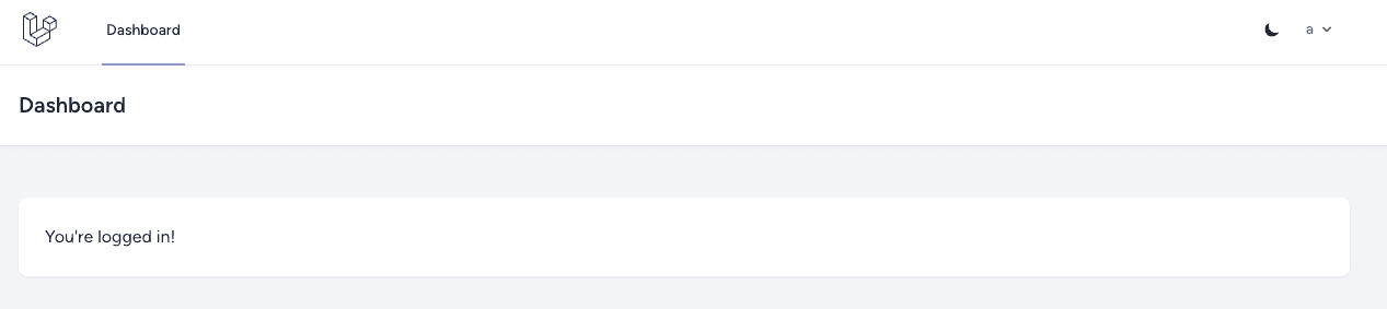
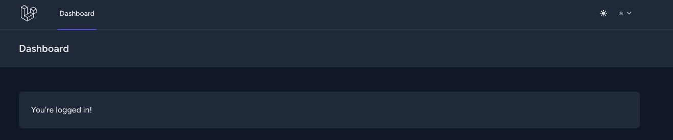
Background
When setting up Laravel with starter kits like Breeze, you may encounter a prompt:
Would you like dark mode support?Even if you select "Yes," there might not be any visible changes. Curious, I decided to investigate further.
This Dark Mode Assumes the Use of TailwindCSS
Setting It Up in tailwind.config.js
TailwindCSS allows you to configure dark mode in its settings file.
export default {
  content: [
    "./vendor/laravel/framework/src/Illuminate/Pagination/resources/views/*.blade.php",
    "./storage/framework/views/*.php",
    "./resources/views/**/*.blade.php",
  ],

  theme: {
    extend: {
      fontFamily: {
        sans: ["Figtree", ...defaultTheme.fontFamily.sans],
      },
    },
  },

  plugins: [forms],
  darkMode: "class", // Add or use 'media'
}
Adding a dark Class to the <html> Tag Enables Dark Mode
By adding a dark class to the <html> tag, dark mode is activated.
This means toggling dark mode can be implemented by adding or removing this class dynamically.
<html class="dark">
  <body>
    ...
  </body>
</html>
Using the dark: Prefix for Dark Mode Styles
By prefixing classes with dark:, you can define styles specifically for dark mode.
<html class="dark">
  <body>
    <div
      class="bg-gray-50 dark:bg-black text-black/50 dark:text-white/50"
    ></div>
  </body>
</html>
If You’re Not Using Tailwind
If you’re not using TailwindCSS, you can use SASS with nested styles for better readability.
/* Dark mode styles */
.dark {
  body {
    background-color: #000;
    color: #fff;

    h1 {
      color: #ccc;
    }

    a {
      color: lightblue;

      &:hover {
        text-decoration: underline;
        color: #00ffff;
      }
    }
  }
}
Implementation Steps
Update tailwind.config.js
  plugins: [forms],
  darkMode: "class", // Add or use 'media'
Selecting media enables automatic dark or light mode based on the user’s device settings. Here, we choose class for manual toggling, starting with the media preference as the default.
Create a JavaScript File for Mode Switching
resources/js/
    ├── app.js
    ├── darkmode.js // Create this file
    ├── bootstrap.js
darkmode.js
// Button to enable dark mode
var toggleDarkModeIcon = document.getElementById("js__toggle_dark_mode_icon")
// Button to enable light mode
var toggleLightModeIcon = document.getElementById("js__toggle_light_mode_icon")

// Initial state on page load
const colorMode = localStorage.getItem("color-mode")
if (
  colorMode === "dark" ||
  ((!colorMode || colorMode.trim() === "") &&
    window.matchMedia("(prefers-color-scheme: dark)").matches)
) {
  toggleLightModeIcon.classList.remove("hidden")
  if (!colorMode || colorMode.trim() === "") {
    localStorage.setItem("color-mode", "dark")
  }
} else {
  toggleDarkModeIcon.classList.remove("hidden")
  if (!colorMode || colorMode.trim() === "") {
    localStorage.setItem("color-mode", "light")
  }
}

// Toggle color mode and manage state in localStorage
function toggleColorMode() {
  toggleDarkModeIcon.classList.toggle("hidden")
  toggleLightModeIcon.classList.toggle("hidden")

  if (localStorage.getItem("color-mode") === "light") {
    document.documentElement.classList.add("dark")
    localStorage.setItem("color-mode", "dark")
  } else {
    document.documentElement.classList.remove("dark")
    localStorage.setItem("color-mode", "light")
  }
}

export default toggleColorMode
Update app.js
import "./bootstrap"
import toggleColorMode from "./darkmode"

document
  .getElementById("js__toggle_color_mode_btn")
  .addEventListener("click", toggleColorMode)
Add the Toggle Button
Insert the following code at an appropriate location. You can customize the icons or use text instead as long as the IDs remain the same.
<button id="js__toggle_color_mode_btn" type="button" class="text-sm p-2.5">
  <svg
    id="js__toggle_dark_mode_icon"
    class="hidden w-4 h-4"
    fill="currentColor"
    viewBox="0 0 20 20"
    xmlns="http://www.w3.org/2000/svg"
  >
    <path
      d="M17.293 13.293A8 8 0 016.707 2.707a8.001 8.001 0 1010.586 10.586z"
    ></path>
  </svg>
  <svg
    id="js__toggle_light_mode_icon"
    class="hidden w-4 h-4 text-white"
    fill="currentColor"
    viewBox="0 0 20 20"
    xmlns="http://www.w3.org/2000/svg"
  >
    <path
      d="M10 2a1 1 0 011 1v1a1 1 0 11-2 0V3a1 1 0 011-1zm4 8a4 4 0 11-8 0 4 4 0 018 0zm-.464 4.95l.707.707a1 1 0 001.414-1.414l-.707-.707a1 1 0 00-1.414 1.414zm2.12-10.607a1 1 0 010 1.414l-.706.707a1 1 0 11-1.414-1.414l.707-.707a1 1 0 011.414 0zM17 11a1 1 0 100-2h-1a1 1 0 100 2h1zm-7 4a1 1 0 011 1v1a1 1 0 11-2 0v-1a1 1 0 011-1zM5.05 6.464A1 1 0 106.465 5.05l-.708-.707a1 1 0 00-1.414 1.414l.707.707zm1.414 8.486l-.707.707a1 1 0 01-1.414-1.414l.707-.707a1 1 0 011.414 1.414zM4 11a1 1 0 100-2H3a1 1 0 000 2h1z"
      fill-rule="evenodd"
      clip-rule="evenodd"
    ></path>
  </svg>
</button>
Summary
You can now toggle between dark mode and light mode. The next step is to refine the styles for both modes using CSS or TailwindCSS.
While the prompt for dark mode support in Laravel seemed intriguing, it turns out to be just a class added to the HTML tag. This essentially doubles the styling work for the same screen. Unless there’s a compelling reason, it might not be a necessary feature.
What kinds of services truly need dark mode? Perhaps those involving long viewing durations or media? In my case, implementing dark mode was more of a curiosity-driven exercise. I hope this guide helps someone!


