How to Use Vuetify's v-dialog
Thank you for your continued support.
This article contains advertisements that help fund our operations.
Table Of Contents
Let's implement a modal easily using Vue's Vuetify v-dialog
What is Vuetify's v-dialog
Vuetify is a UI framework for Vue.
It provides useful components, making it easy to implement useful UI with copy and paste.
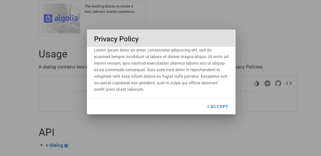
This time, we will write about how to use v-dialog, which allows you to implement the super convenient dialog (modal) feature among them.
Official Vuetify Documentation
How to Align v-col, v-select, and v-btn to Center in Vuetify
Implementing v-dialog
Here's how to set up an environment where you can use Vuetify with Laravel.
⇨ Setting up Laravel + Vue.js + Vue-Router+Vuetify
The usage is very simple.
By copying and pasting, you can basically use it, but this time we want to pick up only the essentials.
<template>
    <v-dialog v-model="dialog">
        Check out the ad content if it's helpful⭐️
    </v-dialog>
</template>

<script>
  export default {
    data() {
      return {
        dialog: false
      };
    }
  };
</script>
That's all for the preparations.
However, currently nothing is displayed.
Set the data dialog to true.
    data() {
      return {
        dialog: true
      };
    }
The text is displayed as shown in the image, although it may be difficult to see due to the similar background color.
If you click outside the dialog area, the dialog will close. Very convenient.
Setting the background of the text section to white
To make it easier to read, let's set the background to white. Just write basic CSS.
<template>
  <v-dialog v-model="dialog">
    <div style="background:white;color: #222222;">
      Check out the ad content if it's helpful⭐️
    </div>
  </v-dialog>
</template><div style="background:white;color: #222222;"></div>Just this line has been added.
The official documentation contains various information, and it may seem difficult, but you can write CSS normally inside v-dialog and also use components like Vuetify's v-card.
Opening the dialog with a button
The idea is to set the dialog in the data to
false⇨true (open)
true->false (close)
Here's the implementation:
<template>
  <div>
    <!-- Button that triggers the open function when clicked -->
    <v-btn @click="open">Open Dialog</v-btn>
    <v-dialog v-model="dialog">
      <div style="background:white;color: #222222;">
        Check out the ad content if it's helpful⭐️
      </div>
    </v-dialog>
  </div>
</template>

<script>
export default {
  data() {
    return {
      dialog: false
    };
  },
  methods: {
    open: function() {
      this.dialog = true;
    }
  }
};
</script>
Adding color to the overlay of the dialog (the part where clicking closes the dialog)
<template>
  <v-dialog overlay-color="#ffffff" v-model="dialog">
    Check out the ad content if it's helpful⭐️
  </v-dialog>
</template>
Making the width of the dialog narrower
<v-dialog max-width="290" v-model="dialog">
  Check out the ad content if it's helpful⭐️
</v-dialog>
Understand what you can do by looking at the API props
We changed the overlay color and narrowed the width as shown above, which is written in the usage of v-dialog.
Official Vuetify Documentation
By reading this page, you should understand why setting max-width="290" narrowed the width.
(After all, I followed the instructions because they were written in the manual)
This area may be a bit difficult due to its customizability, but it's knowledge that can be used with other Vuetify components, so be sure to check it out.
Conclusion
We tried using v-dialog with Vuetify.
If you found it helpful, please help spread the article (promotion).
If there are any confusing parts or mistakes, please contact me on Twitter.


