What is Vuetify's Grid System? How to Use <v-col> [Beginner-Friendly]
Thank you for your continued support.
This article contains advertisements that help fund our operations.
An introduction to Vuetify's Grid System and how to use <v-col> for beginners.

What is a Grid System?
A Grid System is a mechanism for flexibly laying out content.
Vuetify provides a 12-column grid system based on Flexbox, allowing you to easily create responsive layouts.
Basic Structure
<v-row>
  <v-col cols="4" class="bg-purple-darken-2"></v-col>
  <v-col cols="4" class="bg-light-blue"></v-col>
  <v-col cols="4" class="bg-lime"></v-col>
</v-row>

Explanation of the Basic Structure
Use v-row to align content horizontally.
Specify the width by appending cols= to v-col.
Then, if the sum of cols exceeds 12, it wraps.
Example:
<v-row>
  <v-col cols="4" class="bg-purple-darken-2"></v-col>
  <v-col cols="4" class="bg-light-blue"></v-col>
  <v-col cols="4" class="bg-lime"></v-col>
  <v-col cols="4" class="bg-green">Wraps to next row</v-col>
</v-row>

What Happens When There Are Uneven Columns?
<v-row>
  <v-col cols="4" class="bg-purple-darken-2"></v-col>
  <v-col cols="4" class="bg-light-blue"></v-col>
  <v-col cols="1" class="bg-lime"></v-col>
  <v-col cols="4" class="bg-green">Wraps to next row</v-col>
</v-row>

If there is an uneven column, it gets wrapped to the next row.
Practical Usage
Displaying Content Evenly
<v-row>
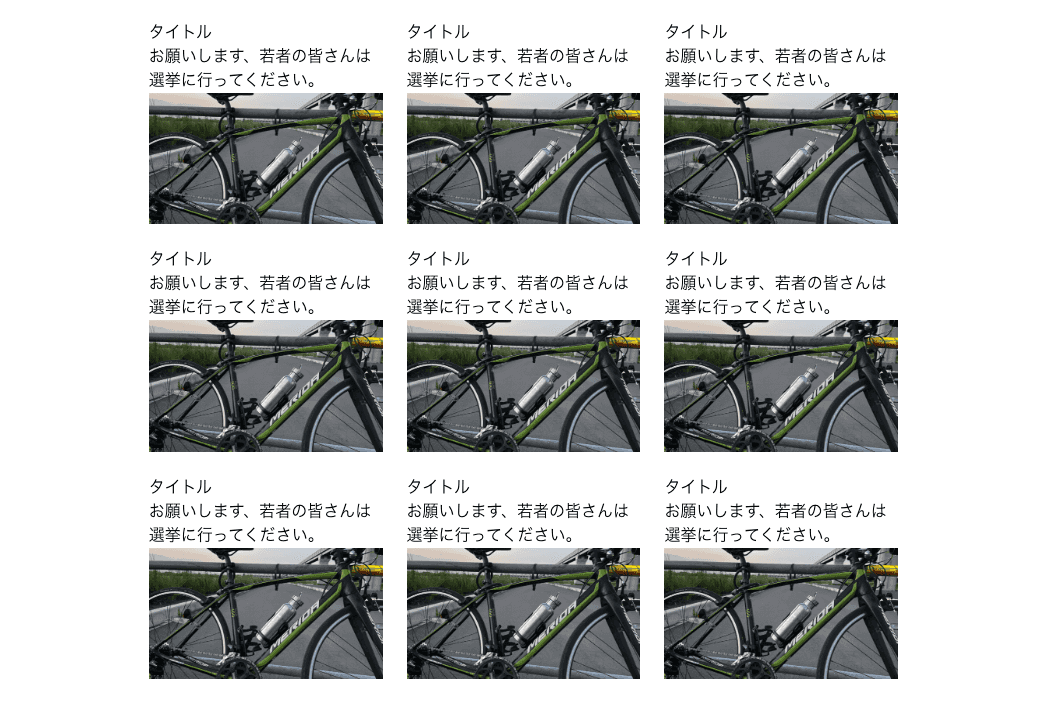
<v-col v-for="post in posts" cols="4" :key="`post${post.id}`">
<div>{{ post.title }}</div>
<div>{{ post.content }}</div>
<img
src="https://laratech.jp/static/a2e620a783f34f2fabd418d31c4b849e/8162c/banner.png"
/>
</v-col>
</v-row>
Adjusting Layout Based on Device Width
<v-col v-for="post in posts" lg="4" sm="6" cols="12" :key="`post${post.id}`">
  <div>{{ post.title }}</div>
  <div>{{ post.content }}</div>
  <img
    src="https://laratech.jp/static/a2e620a783f34f2fabd418d31c4b849e/8162c/banner.png"
  />
</v-col>
https://vuetifyjs.com/en/components/grids/
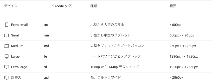
The available tags are listed in the table here, but for the andUp method, the smallest device is specified by cols, and the
sm
md
lg
xl
xxl
The order of adjustment should be in the following order.
Alternating Image and Text Layout
<v-row>
  <v-col cols="8">
    <img
      src="https://laratech.jp/static/a2e620a783f34f2fabd418d31c4b849e/8162c/banner.png"
    />
  </v-col>
  <v-col cols="4">
    <div>This is an old road bike.</div>
  </v-col>
  <v-col cols="4">
    <div>It used to look cool.</div>
  </v-col>
  <v-col cols="8">
    <img
      src="https://laratech.jp/static/a2e620a783f34f2fabd418d31c4b849e/8162c/banner.png"
    />
  </v-col>
</v-row>
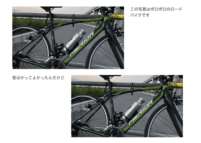
The grid makes it easy to create this kind of arrangement.
Nesting Grids
<v-row>
  <v-col cols="8">
    <img
      src="https://laratech.jp/static/a2e620a783f34f2fabd418d31c4b849e/8162c/banner.png"
    />
    <v-row class="mt-2">
      <v-col cols="6">
        <img
          src="https://laratech.jp/static/a2e620a783f34f2fabd418d31c4b849e/8162c/banner.png"
        />
      </v-col>
      <v-col cols="6">
        <img
          src="https://laratech.jp/static/a2e620a783f34f2fabd418d31c4b849e/8162c/banner.png"
        />
      </v-col>
    </v-row>
  </v-col>
  <v-col cols="4">
    <div>This is an old road bike.</div>
  </v-col>
  <v-col cols="4">
    <div>It used to look cool.</div>
  </v-col>
  <v-col cols="8">
    <img
      src="https://laratech.jp/static/a2e620a783f34f2fabd418d31c4b849e/8162c/banner.png"
    />
    <v-row class="mt-2">
      <v-col cols="6">
        <img
          src="https://laratech.jp/static/a2e620a783f34f2fabd418d31c4b849e/8162c/banner.png"
        />
      </v-col>
      <v-col cols="6">
        <img
          src="https://laratech.jp/static/a2e620a783f34f2fabd418d31c4b849e/8162c/banner.png"
        />
      </v-col>
    </v-row>
  </v-col>
</v-row>
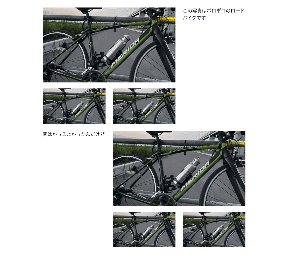
If you understand CSS, of course you can do it, but I tried to use a grid to position the photos that I sometimes see.
Important Notes
The <v-col> component must be a direct child of <v-row> because this grid system is built using display: flex;.
Incorrect Example
<v-row>
  <div>
    <v-col cols="8">
      <img
        src="https://laratech.jp/static/a2e620a783f34f2fabd418d31c4b849e/8162c/banner.png"
      />
    </v-col>
    <v-col cols="4">
      <div>This is an old road bike.</div>
    </v-col>
    <v-col cols="4">
      <div>It used to look cool.</div>
    </v-col>
    <v-col cols="8">
      <img
        src="https://laratech.jp/static/a2e620a783f34f2fabd418d31c4b849e/8162c/banner.png"
      />
    </v-col>
  </div>
</v-row>
If a <div> is placed directly inside <v-row>, it will not function correctly. Always use <v-col> directly under <v-row>.
Conclusion
This grid system is essentially based on the following CSS properties:
display: flex;
flex-wrap: wrap;
When child elements exceed width: 100%, they automatically wrap to the next line.
For example, cols="1" is approximately:
100 / 12 % ≒ 8.33333333333%
max-width: 8.33333333333%;
If you want to adjust spacing, do not use margins on <v-col>; instead, use padding.
Hope this helps!


