How to use Vuetify's v-snackbar
Thank you for your continued support.
This article contains advertisements that help fund our operations.
Table Of Contents
I summarized how to use the convenient Vuetify Snackbar component in Vue.

Introduction
It's essentially a summary of the official documentation.
Since it can be confusing to use Vuetify without being familiar with Vue.js, I hope you find it useful.
As you get used to knowing "where" and "what" is written, you will be able to use other components.
Development Environment
Vue 2.5.17
Vuetify 2.2.3
What is Snackbar?
It looks like this.
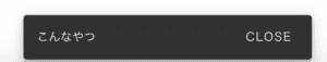
It appears for a few seconds and disappears on its own. Of course, it also disappears when you click CLOSE.
It can be used for small notifications, like "You have logged in".
Basic Usage
<v-btn @click="snackbar = true">Trigger this by clicking</v-btn>
  <v-snackbar v-model="snackbar">
      This is the content
      <v-btn color="pink" text @click="snackbar = false">Close</v-btn>
  </v-snackbar>
~~~

data(){
  return{
        snackbar: false
    }
}
It's that simple to use.
The data defined by v-model as "snackbar" will be displayed when it is true.
Convenient.
Let's Check the Specifications
Although I titled it as "Specifications," it's more like "initial settings".
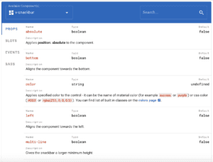
The initial settings are written here.
For example,
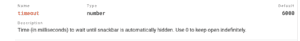
Here, the default timeout is defined as 6000.
In other words, it will disappear after 6 seconds.
I find Vuetify more user-friendly compared to other Material UI because of details like this.
There is also a part that says "top false," and if you set it to true, you will have a rough idea that it might be displayed at the top.
Let's try it out.
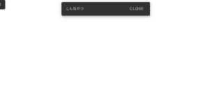
It was displayed at the top. It's hard to see due to the white background, but it is definitely displayed at the top.
<v-snackbar v-model="snackbar" :top="true">
  {{ text }} <v-btn color="pink" text @click="snackbar = false">Close</v-btn>
</v-snackbar>
By simply adding :top="true", it will be displayed at the top. Convenient.
Let's Try Applying it
Currently, it appears when the button is clicked.
For example, let's try displaying the Snackbar when this page is displayed.
<template>
  <div>
    <template>
      <div class="text-center ma-2">
        <v-snackbar v-model="snackbar" :top="true">
          {{ text }}
          <v-btn color="pink" text @click="snackbar = false">Close</v-btn>
        </v-snackbar>
      </div>
    </template>
  </div>
</template>

<script>
  export default {
    data() {
      return {
        text: "Displayed!",
        snackbar: false,
      }
    },
    created() {
      this.show()
    },
    methods: {
      show: function () {
        this.snackbar = true
      },
    },
  }
</script>
With this code, the Snackbar will be displayed when this page is shown.
This is because of the part where it sets snackbar to true.
For example, placing this on a page shown after logging in can display a message like "You have logged in!"
Practical Usage
Let's display it when sending data with axios.
<template>
  <div>
    <template>
      <div class="text-center ma-2">
        <v-btn dark @click="send()">Open Snackbar</v-btn>
        <v-snackbar v-model="snackbar" :top="true">
          {{ message }}
          <v-btn color="pink" text @click="snackbar = false">Close</v-btn>
        </v-snackbar>
      </div>
    </template>
  </div>
</template>

<script>
  export default {
    data() {
      return {
        text: "Data to be sent",
        snackbar: false,
        message: "Error message",
      }
    },
    created() {
      this.show()
    },
    methods: {
      send: function () {
        axios
          .post("/url", {
            text: this.text,
          })
          .then(res => {
            // On success
            this.message = "Sent"
            this.snackbar = true
          })
          .catch(err => {
            // On failure
            this.message = "Failed"
            this.snackbar = true
          })
      },
    },
  }
</script>

Summary
In this article, I have summarized the basic usage of Vuetify's Snackbar.
I hope it was helpful.
For feedback or complaints, please contact me via Twitter DM.
⇨Click here for an article on defining Vuetify's Snackbar with Vuex so you can reuse it anywhere


