How to Use Vuetify's v-btn and Make it Look Stylish
Thank you for your continued support.
This article contains advertisements that help fund our operations.
Table Of Contents
This article summarizes the basic usage of Vuetify's v-btn and how to use it stylishly for links and more. It is written for easy copying and pasting, so please feel free to use it as a reference.

Environment
node --version v16.13.0
  "vue": "^2.5.7"
 "vuetify": "^2.4.2",
Changing Colors
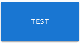
Starting from the default state
<v-btn>Test</v-btn>

Specifying a color (color="blue")
<v-btn color="blue">Test</v-btn>

Using Vuetify's special color codes for color (primary)
<v-btn color="primary">Test</v-btn>

Other options include:
- secondary
- error
It is also possible to assign names to colors you frequently use.
Making the background transparent with a thin border (outlined)
<v-btn outlined color="blue">Test</v-btn>

Making the background transparent (text)
<v-btn text color="blue">Test</v-btn>

Changing Shapes and Sizes
Changing the size (small)
<v-btn small color="primary">Test</v-btn>

Options include:
- x-small
- small
- large
- x-large
Rounding the corners (rounded)
<v-btn rounded color="primary">Test</v-btn>

Completely removing rounded corners (tile)
<v-btn tile color="primary">Test</v-btn>

Specifying height and width
<v-btn height="80" width="160" color="primary">Test</v-btn>
Improving Usability
Adding a loading indicator (:loading="true")
<v-btn :loading="true" color="primary">Test</v-btn>

By passing false to :loading, the loading indicator will disappear, so you can easily add a loading indicator to a button by setting it to true when a process starts and false when it ends.
Loading Example
<template>
  <v-btn @click="post" :loading="loading" color="primary">Test</v-btn>
</template>

<script>
  export default {
    data() {
      return {
        loading: false,
        test: "test",
      }
    },
    methods: {
      post: function () {
        this.loading = true // start loading here
        // Write your process here
        // For example
        axios
          .post("/test", {
            test: this.test,
          })
          .then(data => {
            this.loading = false // stop loading here
          })
      },
    },
  }
</script>
Recommended Layouts
Using as a link
<v-btn to="/news" color="orange" outlined rounded style="font-weight: bold;"
  >Click Here for News</v-btn
>

// Alternate method for 'to': Use ':to="{name: 'news'}"'

By using to, you can easily create links using VueRouter.
If you are using Nuxt, you can specify that it is a nuxt-link by using the props property.
Conclusion
I have written some samples using v-btn.
While the information is also available in the official documentation, I hope this explanation is more understandable for you.
For complaints or questions, please contact me via TwitterDM! Thank you and see you later!


