How I Solved the Issue of v-icon Not Working in Vuetify and Its Basic Usage
Thank you for your continued support.
This article contains advertisements that help fund our operations.
Table Of Contents
A summary of how I solved the issue when v-icon in Vuetify didn’t display, along with its basic usage.

What is v-icon?
The v-icon is a component available in Vuetify, a UI framework for Vue.js.
Using this component allows you to easily implement stylish icons like the one shown below.
What is Vuetify? Introduction to Installation and Core Components [Vue.js]
What Icons Can Be Used with v-icon?
With Vuetify's v-icon, you can use icons from the following sites:
You can select which one to use from these four options.
If you didn’t change any settings and simply installed Vuetify, it likely defaults to using Material Design Icons.
How to Use Material Design Icons with v-icon
In most cases, these icons are installed automatically, or the instructions you’re following might include steps for integrating them.
First, let’s check if the icon displays with the following tag:
<v-icon>mdi-plus-thick</v-icon>If it still doesn’t work, the settings to enable icon usage might not be configured.
The setup method varies depending on how your project was initially created.
Vue CLI
npm install @mdi/font -Dsrc/plugins/vuetify.js
import "@mdi/font/css/materialdesignicons.css" // Ensure you are using css-loader
import { createVuetify } from "vuetify"

export default createVuetify({
  icons: {
    defaultSet: "mdi", // This is already the default value - only for display purposes
  },
})
For Laravel
npm i @mdi/fontresources/app.js
// Add the following:
import "@mdi/font/css/materialdesignicons.css"
import "vuetify/styles"
import { createVuetify } from "vuetify"
import * as components from "vuetify/components"
import * as directives from "vuetify/directives"

const vuetify = createVuetify({
  components,
  directives,
})
// End of addition

// Add to use section
createInertiaApp({
  // Omitted for brevity
  setup({ el, App, props, plugin }) {
    return createApp({ render: () => h(App, props) })
      .use(vuetify) // ← Add this line
      .mount(el)
  },
})
Once configured, you should be able to use icons as shown below:
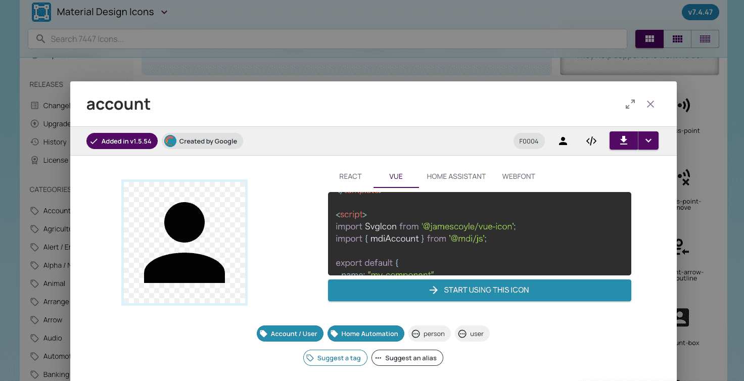
<v-icon>mdi-plus-thick</v-icon>The mdi-plus-thick part can be confirmed on Material Design Icons.
In most cases, adding the mdi- prefix should work, but you can also refer to the VUE tab as shown in the image below.
Solutions for When v-icon Does Not Display
Alias Changed
Some icons may have changed aliases, and if you’re following an outdated guide, the icon might not display as expected.
Material Design Icons - History
When I was following a Udemy course, I didn’t know about this change, which is why my icons weren’t displaying.
By specifying icons that are still supported, I was able to use them.
Not Wrapping with
A common mistake is not wrapping everything in the <v-app> tag, without which Vuetify won’t work.
If Vuetify is already functioning correctly in your project, you should be fine, but without wrapping content in <v-app>, Vuetify components won’t display.
<template>
  <v-app>
    <NuxtPage />
  </v-app>
</template>
How to Optimize for Performance
To prevent loading unnecessary icons, you can only install the icons you need into your application bundle.
Without following this method, the JS or CSS files may become large, which can slow down loading times.
This step is recommended if you want to improve load speeds.
Command
npm install @mdi/js -DConfiguration File
Vue CLI
src/plugins/vuetify.js
import { createVuetify } from "vuetify"
import { aliases, mdi } from "vuetify/iconsets/mdi-svg"

export default createVuetify({
  icons: {
    defaultSet: "mdi",
    aliases,
    sets: {
      mdi,
    },
  },
})
For Laravel
resources/js/app.js
// Vuetify
// import "@mdi/font/css/materialdesignicons.css";
import "vuetify/styles"
import { aliases, mdi } from "vuetify/iconsets/mdi-svg"
import { createVuetify } from "vuetify"
import * as components from "vuetify/components"
import * as directives from "vuetify/directives"

const vuetify = createVuetify({
  components,
  directives,
  icons: {
    defaultSet: "mdi",
    aliases,
    sets: {
      mdi,
    },
  },
})
Display
Import and use icons in each component.
<template>
  <v-icon :icon="mdiAccount" />
</template>

<script setup>
  import { mdiAccount } from "@mdi/js"
</script>
With this setup, only the necessary icons are loaded.
You can also set variables globally for reusability, but this is omitted here.
Vuetify - v-icon #MDI - JS SVG
Summary
That’s it.
When I first used Vuetify in a Udemy course, I found the official documentation easy to read, which helped me get comfortable with using UI components.
→ Vue.js + Firebase Single Page Application Course
I hope this is helpful to someone.


