What is Vuetify? How to Install and Key Components Overview [Vue.js]
Thank you for your continued support.
This article contains advertisements that help fund our operations.
Table Of Contents
Explanation of Vuetify, a UI component library for Vue.js
What is Vuetify?
Vuetify is a popular UI framework for Vue.js.
Vuetify is based on Google’s Material Design guidelines and allows you to create beautiful and interactive services with simple code.
It’s also customizable, making it a very useful tool.
What is a UI Framework?
A UI framework is a collection of tools or libraries for efficiently creating user interfaces (UI).
For example, it helps you implement commonly used elements like:
- Buttons
- Forms
- Navigation menus
- Modal windows
By using these, developers can reduce the manual work needed to create UIs and quickly improve the design and user experience of an application.
Other UI Frameworks
- BootstrapVue (Vue)
- Material UI (React)
- Chakra UI (React)
There are other UI frameworks as well.
Now Compatible with Vue3
Note that Vuetify’s documentation differs depending on whether you are using Vue2 or Vue3.
Vuetify 2 is compatible with Vue2, and Vuetify 3 is compatible with Vue3, so make sure to choose the right version for your environment.
How to Install Vuetify
After installing and configuring it, you can use Vuetify in various projects. However, the installation method differs depending on the project.
For Nuxt3
Assuming that a Nuxt3 project is already underway.
Install the necessary packages via command:
npm i -D vuetify vite-plugin-vuetify
npm i @mdi/font
Add to nuxt.config.ts
// https://nuxt.com/docs/api/configuration/nuxt-config
import vuetify, { transformAssetUrls } from "vite-plugin-vuetify" // Add this

export default defineNuxtConfig({
  compatibilityDate: "2024-04-03",
  devtools: { enabled: true },

  // Add the following
  build: {
    transpile: ["vuetify"],
  },
  modules: [
    (_options, nuxt) => {
      nuxt.hooks.hook("vite:extendConfig", config => {
        // @ts-expect-error
        config.plugins.push(vuetify({ autoImport: true }))
      })
    },
    //...
  ],
  vite: {
    vue: {
      template: {
        transformAssetUrls,
      },
    },
  },
})
Create vuetify.ts
Create a file named plugins/vuetify.ts and add the following code. If the plugins directory doesn’t exist, create it in the root directory.
// import this after installing `@mdi/font` package
import "@mdi/font/css/materialdesignicons.css"

import "vuetify/styles"
import { createVuetify } from "vuetify"

export default defineNuxtPlugin(app => {
  const vuetify = createVuetify({
    // ... your configuration
  })
  app.vueApp.use(vuetify)
})
This code initializes Vuetify, and plugins placed in the plugins directory are automatically loaded when Nuxt starts.
Wrap with <v-app>
To use Vuetify, wrap the component with <v-app>. For example, wrapping the entire content in app.vue with the v-app component allows you to use Vuetify on each page.
<template>
  <v-app>
    <Header />
    <NuxtPage />
    <Footer />
  </v-app>
</template>
This is how you introduce Vuetify in Nuxt3.
For Laravel
Starting with a Vue3 setup running with Vite, such as Inertia.
Install necessary packages via command:
npm i vuetify
npm i @mdi/font
Add to app.js
Add the following to resources/app.js:
import { createApp, h } from "vue"
import { createInertiaApp } from "@inertiajs/vue3"
import { resolvePageComponent } from "laravel-vite-plugin/inertia-helpers"
import { ZiggyVue } from "../../vendor/tightenco/ziggy"

// Add the following
import "@mdi/font/css/materialdesignicons.css"
import "vuetify/styles"
import { createVuetify } from "vuetify"
import _ as components from "vuetify/components"
import _ as directives from "vuetify/directives"

const vuetify = createVuetify({
components,
directives,
})
// End of added part, another mention of use is below

const appName = import.meta.env.VITE_APP_NAME || "Laravel"

createInertiaApp({
title: title => `${title} - ${appName}`,
resolve: name =>
resolvePageComponent(
`./Pages/${name}.vue`,
import.meta.glob("./Pages/\*_/_.vue")
),
setup({ el, App, props, plugin }) {
return createApp({ render: () => h(App, props) })
.use(vuetify) // ← Add this
.use(plugin)
.use(ZiggyVue)
.mount(el)
},
progress: {
color: "#4B5563",
},
})
Wrap with <v-app></v-app>
To use Vuetify, you need to wrap components with <v-app></v-app>. For example, wrap the desired area as follows:
resouces/js/Layouts/AppLayout.vue
<template>
  <main>
    <v-app>
      <slot />
    </v-app>
  </main>
</template>
Implementation Example
Carousel
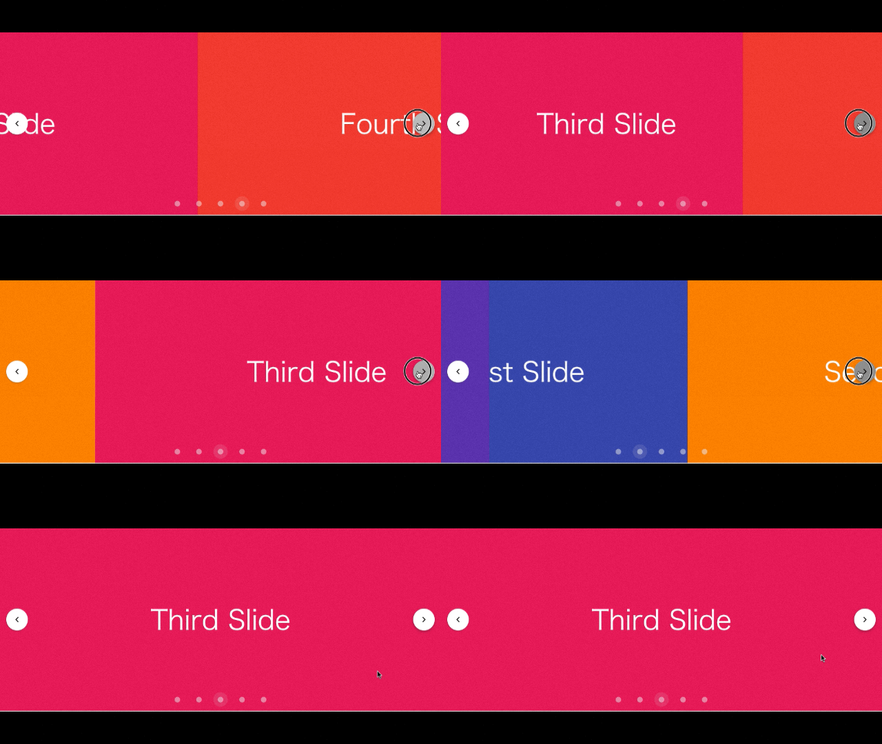
A carousel is used when you want to create a horizontal slide effect.
Here’s how to implement a horizontal slide like a GIF:
<script setup>
import { ref, onMounted } from "vue"
const slides = ref(["First", "Second", "Third", "Fourth", "Fifth"])
const colors = ref([
  "indigo",
  "warning",
  "pink darken-2",
  "red lighten-1",
  "deep-purple accent-4",
])
</script>

<template>
  <v-carousel height="400" show-arrows="hover" cycle hide-delimiter-background>
    <v-carousel-item v-for="(slide, i) in slides" :key="i">
      <v-sheet :color="colors[i]" height="100%">
        <div class="d-flex fill-height justify-center align-center">
          <div class="text-h2">{{ slide }} Slide</div>
        </div>
      </v-sheet>
    </v-carousel-item>
  </v-carousel>
</template>
If you think it looks too complicated, don’t worry—it’s just copied code from the official documentation.
You can copy and paste any code you like and implement it directly.
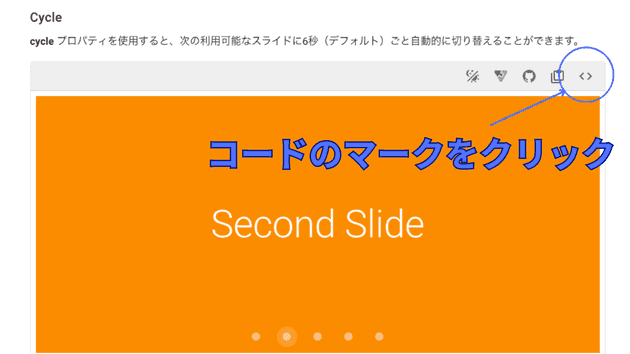
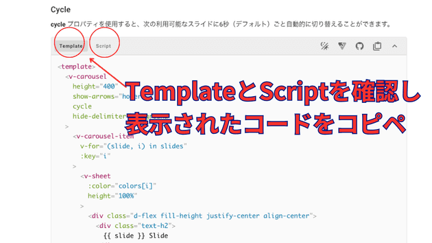
Click the code symbol.
You can copy and paste the code displayed, but if there are variables in the template, make sure to also copy the corresponding script for the variables.
Modal Window (Dialog)
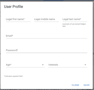
It’s a feature that displays a dialog when a button is clicked.
<template>
  <v-dialog v-model="dialog">
    You can freely add text or div tags here.
  </v-dialog>
</template>

<script>
export default {
    return {
        data(){
            dialog: false // Open the dialog when set to true
        }
    }
}
</script>
I wrote more details in a separate article.
⇨ How to Use Vuetify's v-dialog
Menu Bar

The menu bar can be easily implemented.
It will also appear in the navigation bar mentioned later.
<v-app-bar :elevation="2">
<template v-slot:prepend>
<v-app-bar-nav-icon></v-app-bar-nav-icon>
</template>

<v-app-bar-title>Application Bar</v-app-bar-title>
</v-app-bar>
Navigation (Sidebar)
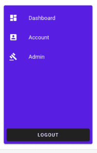
By simply toggling the drawer between True and False, you can open and close it.
<template>
  <v-app>
    <v-card>
      <v-layout>
        <v-app-bar color="primary" prominent>
          <v-app-bar-nav-icon
            variant="text"
            @click.stop="drawer = !drawer"
          ></v-app-bar-nav-icon>

          <v-toolbar-title>My files</v-toolbar-title>

          <v-spacer></v-spacer>

          <template v-if="$vuetify.display.mdAndUp">
            <v-btn icon="mdi-magnify" variant="text"></v-btn>

            <v-btn icon="mdi-filter" variant="text"></v-btn>
          </template>

          <v-btn icon="mdi-dots-vertical" variant="text"></v-btn>
        </v-app-bar>

        <v-navigation-drawer
          v-model="drawer"
          :location="$vuetify.display.mobile ? 'bottom' : undefined"
          temporary
        >
          <v-list :items="items"></v-list>
        </v-navigation-drawer>

        <v-main style="height: 500px">
          <v-card-text>
            The navigation drawer will appear from the bottom on smaller size
            screens.
          </v-card-text>
        </v-main>
      </v-layout>
    </v-card>
  </v-app>
</template>
<script>
export default {
  data: () => ({
    drawer: false,
    group: null,
    items: [
      {
        title: "Foo",
        value: "foo",
      },
      {
        title: "Bar",
        value: "bar",
      },
      {
        title: "Fizz",
        value: "fizz",
      },
      {
        title: "Buzz",
        value: "buzz",
      },
    ],
  }),

  watch: {
    group() {
      this.drawer = false
    },
  },
}
</script>
Buttons and Icons
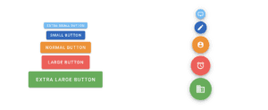
Very convenient.
<v-btn depressed color="primary">
  Primary
</v-btn>
⇨ Solution when v-icon is not working
Customization Method
Using a convenient modal window as an example, here’s how to customize.
The above page contains many sample codes and links to pages that detail each component.
The page you are directed to lists props for customization.
For example, if you see min-width string | number:
<v-dialog :min-width="500"> </v-dialog>If you see fullscreen boolean:
<v-dialog fullscreen></v-dialog>
or
<v-dialog :fullscreen="true"></v-dialog>
This allows you to change the default settings and customize as needed.
This is available for each component, and you can check and use the API page for the specific component.
Conclusion
This article turned out to be quite long due to the lengthy code sections.
I hope it helps someone.
